A picture can speak
a thousand words. Pictures can bring a
document or presentation to life. So you
wouldn't want them to be dull and lifeless would you?
These days we use
all sorts of devices to take photos, not just cameras. It's great that we can take pictures with
phones and tablets, but the quality isn't always that great. Even snapshots taken on our cameras can
sometimes look a bit flat, especially when the British weather fails to provide
us with perfect lighting! In the past we
had to use specialist software like Photoshop to correct pictures. Here I'm
going to look at a few techniques available in Office 2010 to adjust your
photos and bring them to life.
In these examples I
am using Word, but these options are also available in PowerPoint. When you click on a picture in Word or
PowerPoint you will see a new tab appear on the Ribbon called Picture Tools
Format and the adjustment options shown here are can be found on that tab.
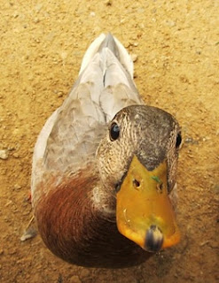
Here's a picture of
a duck.
This is the picture
as it was taken.
 First of all, we
probably don't want those feet in there so we can crop the picture so that we
just see the duck.
Cropping cuts away
the edges of the picture - the bits we don't want. It is useful where we have things in the
picture (such as my husband's feet) that we don't want. Even if the feet weren't there, the image
becomes much more engaging when the subject matter (the duck) fills the picture
so getting rid of any extra bits is always a good idea. You should also think about cropping if you
have a picture that doesn't quite fit the space you have for it. Rather than squashing or stretching the image
to fit, look at removing any bits that are not necessary.
Don't be scared of
cropping - the bits you have cut away are still there in the memory so if you
decide you want to put them back in later you can.
Next, the sun had
disappeared and the picture is a bit dull and grey.
We can adjust the colour tone and saturation to make the picture seem
warmer and richer. You will find these
behind the Color button.
Here I have adjusted
the colour tone to it's warmest but I have left the saturation as is.
Finally, while the
camera's focus is quite good, the duck wasn't co-operating by standing still so
it could be better. (Seconds after the photo was taken the duck tried to eat the camera and succeeded in taking a lump out of my husband's finger!)
Using the
Corrections button, I have taken both the sharpness and contrast up a level. Now you can see much more definition of the
bird's feathers, making the picture much more life-like.
What else can you do
with images?
In Word you can then set text wrapping to
'Tight' so that your text lines up to the shape of the image. As with cropping, the background is still in
memory so you can choose to put it back if you wish. It works best if there is quite a good degree
of contrast between the subject and the background. You may need to play around with it a bit to
get all of the subject included.
Or you could apply
Artistic Effects - for example turning our duck picture into a pencil sketch…
You could also try some of the Picture Styles to add a border, frame, shadow or reflection. These can make the picture stand out from the page more.
Finally, when you
are happy with your pictures you will want to save your document or slide
show. Remember that photographs taken
with modern digital cameras can be several MB in size. If you have a number of pictures in your
document then your file is going to be huge. Not only will this take up
valuable space on your computer or network, but it also means that your
document or slide show will be slow to open and to navigate.
Word and PowerPoint
both have a setting to compress pictures.
This reduces the file size in two ways.
First of all, you are given the option to remove cropped areas -
remember I said that the bits you cropped away were still there? They are taking up space so if you are sure
you don't want them, get rid of them.
Secondly it reduces
the resolution of the picture. The level
you want to reduce it to will depend on how your document or slide show will be
viewed. If the document is going to be
professionally printed you will want to keep a fairly high resolution. If it is to be viewed on screen then a medium
resolution is good. If it is to be
published on the web or if you need to email it to other people then you will
want to minimise the resolution and thus minimise the file size.
There are so many picture editing options it would be impossible to show them all.
Remember, if you need some help working with images in your documents or with bringing your PowerPoint slides to life, call NIMBUS solutions on 07733 341452 or visit www.nimbus-solutions.co.uk to find out more about how we can help.


No comments:
Post a Comment